 |
| All White walls add a crispness to a room not to mention making it appear larger. Light colored woods on furniture add another texture while pops of color add interest. |
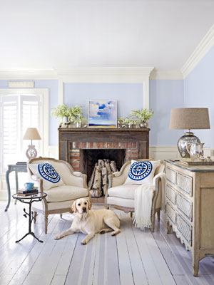 |
| The same goes for light White Washed wood floors. The vertical pattern extends the eye. Subtle blue walls soothes and these navy pillows bring a bold color into the room making all the white just that much more fresh! Adding light colored wood furniture gives the room a very casual look and feel. The lab doesn't hurt either! |
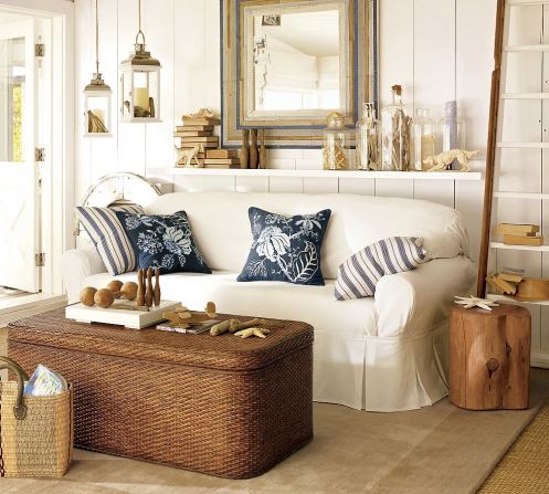 |
| I absolutely LOVE this room! Vertical White paneling. Moves the eye up, again making a room appear taller. White Furniture covers are so easy to pull off and wash. Don't be afraid of white. Think of small trunks as decor not only as storage. Bring outside lantern's in, why not? The stump of wood adds yet another texture and it doubles as a side table. ~*~ There are so many pictures I could show you but instead of looking at them and dreaming about what your house could be why don't you just go and paint a room white and start there. Don't be afraid of white and think it is so boring. Pictures are great idea motivators and these I hope will motivate you to try something a little different a little daring. Yes! White is daring for some. I have used BEHR, Plantation White for year's now. From ceilings to walls to trim. I love that it is not a bright white or an optic white. It goes with any color. It is a clean fresh white. If your local hardware store does not have a color card sample of it they still should be able to make it just by the name, Plantation White from BEHR. I highly recommend it and several of my own friends love it too! As they say in the paint world, "It's only paint, if you don't like it paint over it". Sharon :0) |
I've been trying desperately to find a nice neutral for a girl's bedroom that has one accent wall painted in Sherwin Williams Dress Blues (dark royal/navy blue). Well I was just at Home Depot where I encountered a couple and their contractor, who was throwing a fit over the fact that they had mixed "BEE Plantation White" instead of "BEO Plantation White." The BEE version appeared slightly more yellow, while the BEO version looked a tiny bit lighter. The amazing part was that, although it's a Behr color, the store didn't have any card samples, as I guess it's an older one. I loved the BEE one though and took home a sample, thinking about using it with either Dress Blues or maybe another dark blue, SW Indigo Batik. Any thoughts on these variations or other neutrals (not too gray) that could go well wth a navy accent wall?
ReplyDelete